Create real TikTok Grid mockups using our mockup builder - no Photoshop or design skills needed.
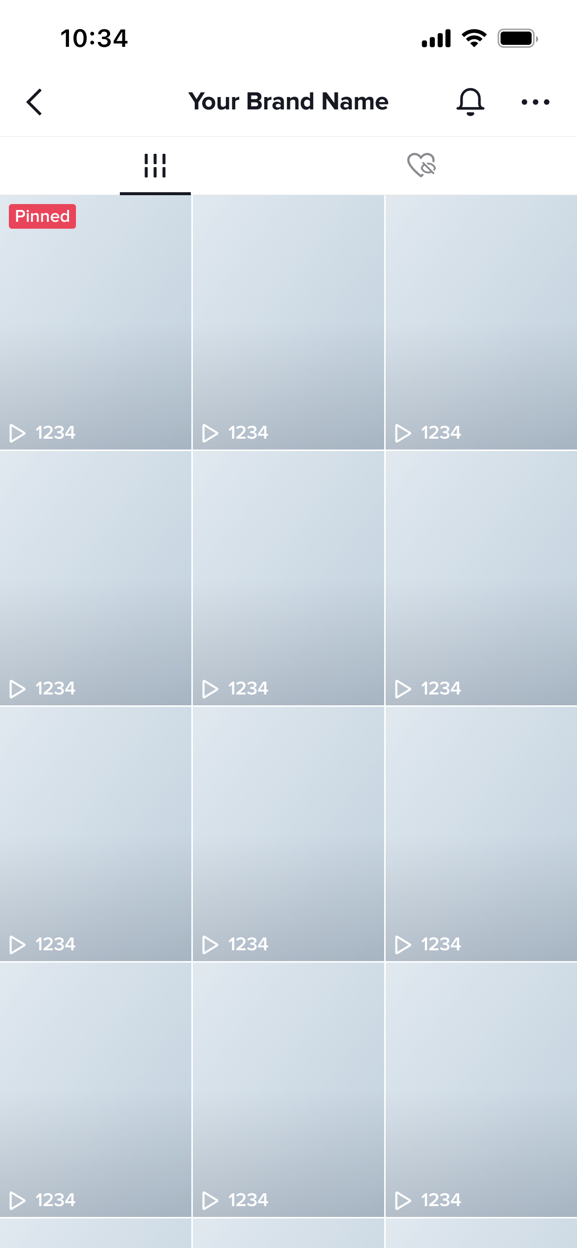
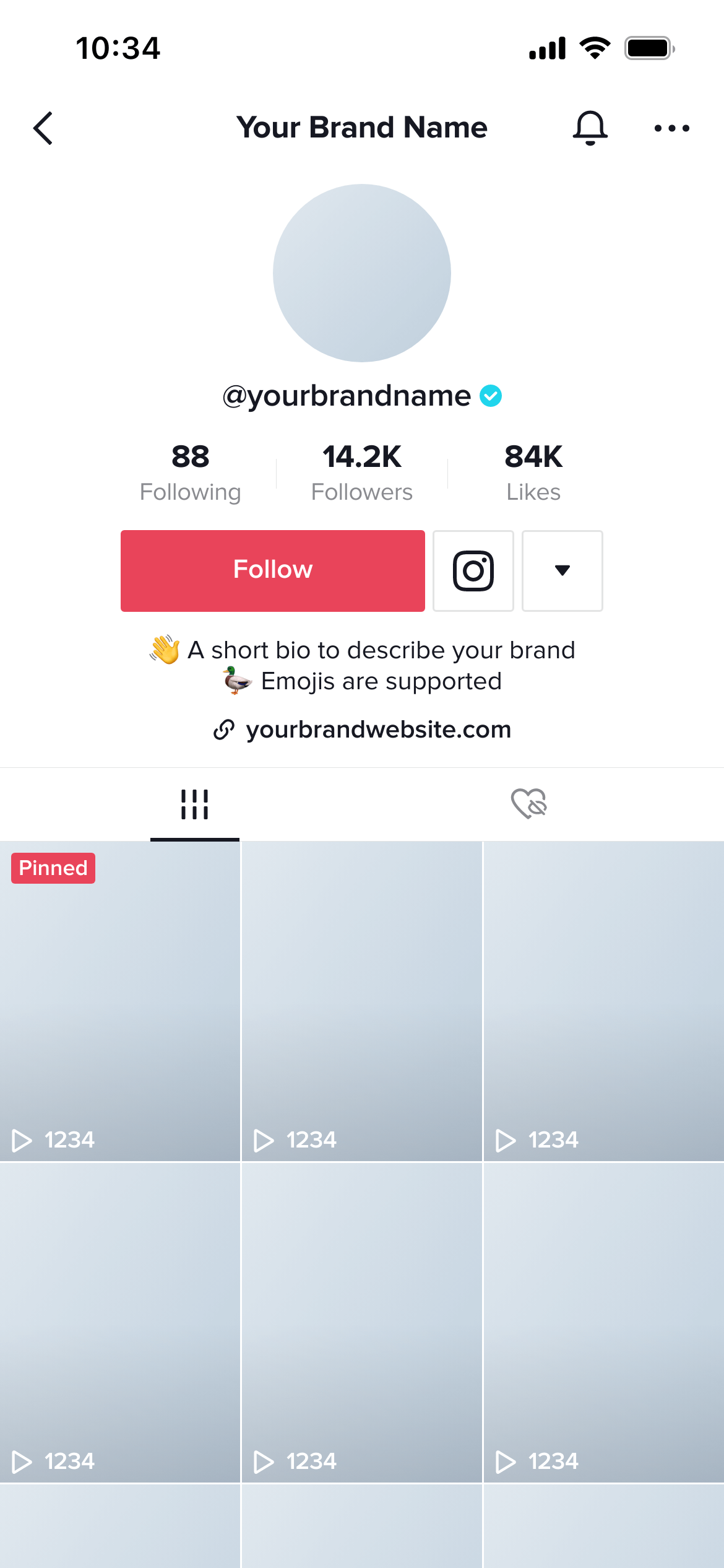
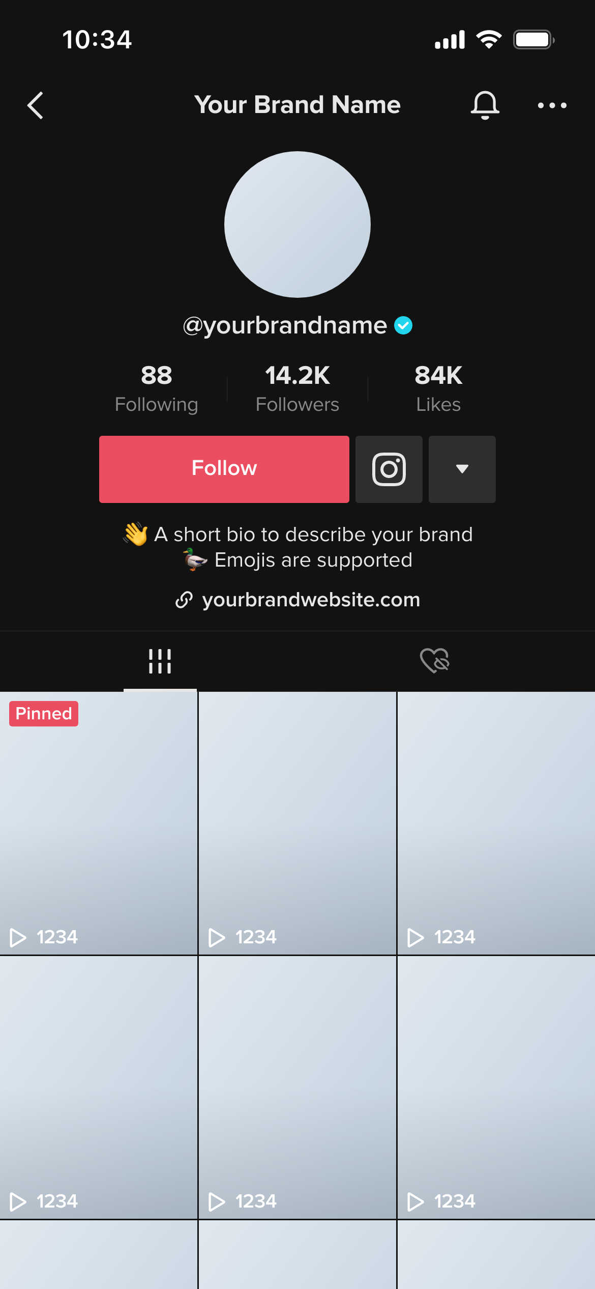
A TikTok grid mockup shows the video thumbnail grid as it appears on a TikTok profile - the three-column arrangement of video covers that visitors see when they scroll through an account’s content. It lets you plan and preview the visual pattern of thumbnails before any videos are published.
TikTok’s algorithm distributes content through the For You page, so the grid is viewed less obsessively than Instagram’s. But it still shapes the first impression when someone actively visits a profile - and for brands and creators building a TikTok presence, it’s a meaningful expression of content strategy.
A grid mockup helps you:
Account launch planning - Mock up the first nine thumbnails before launch so the grid starts with a coherent visual identity.
Branded content series - If a brand is producing a content series, the grid mockup shows whether the series thumbnails will look consistent when viewed together.
Agency pitches - Show a prospective client what their TikTok presence could look like at scale, not just one video at a time.
Design thumbnails as a system. The most effective TikTok grids have a recognisable visual language - consistent typography placement, recurring colour palette, or a repeating structural element. The grid mockup is where you evaluate whether your thumbnails read as a system.
Consider alternating formats. Grids that alternate between two distinct thumbnail styles (text-led vs. image-led, for example) often have more visual rhythm than grids where every thumbnail uses the same approach.
Check dark mode. Mockupduck shows the same grid in both light and dark mode - worth reviewing before any client presentation.
Join thousands of social media marketers like you using Mockupduck to plan, visualize and get fast approval on their social media content