Create real Instagram Grid mockups using our mockup builder - no Photoshop or design skills needed.
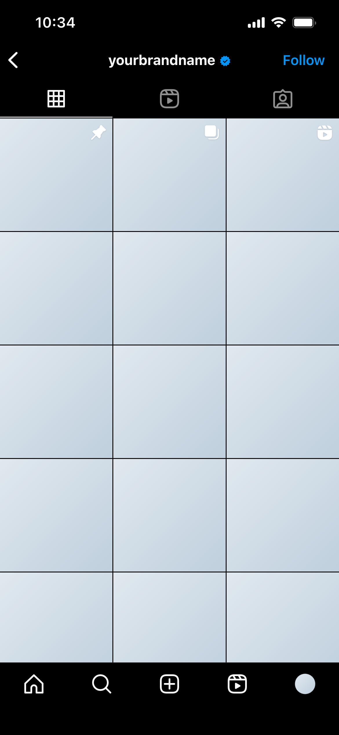
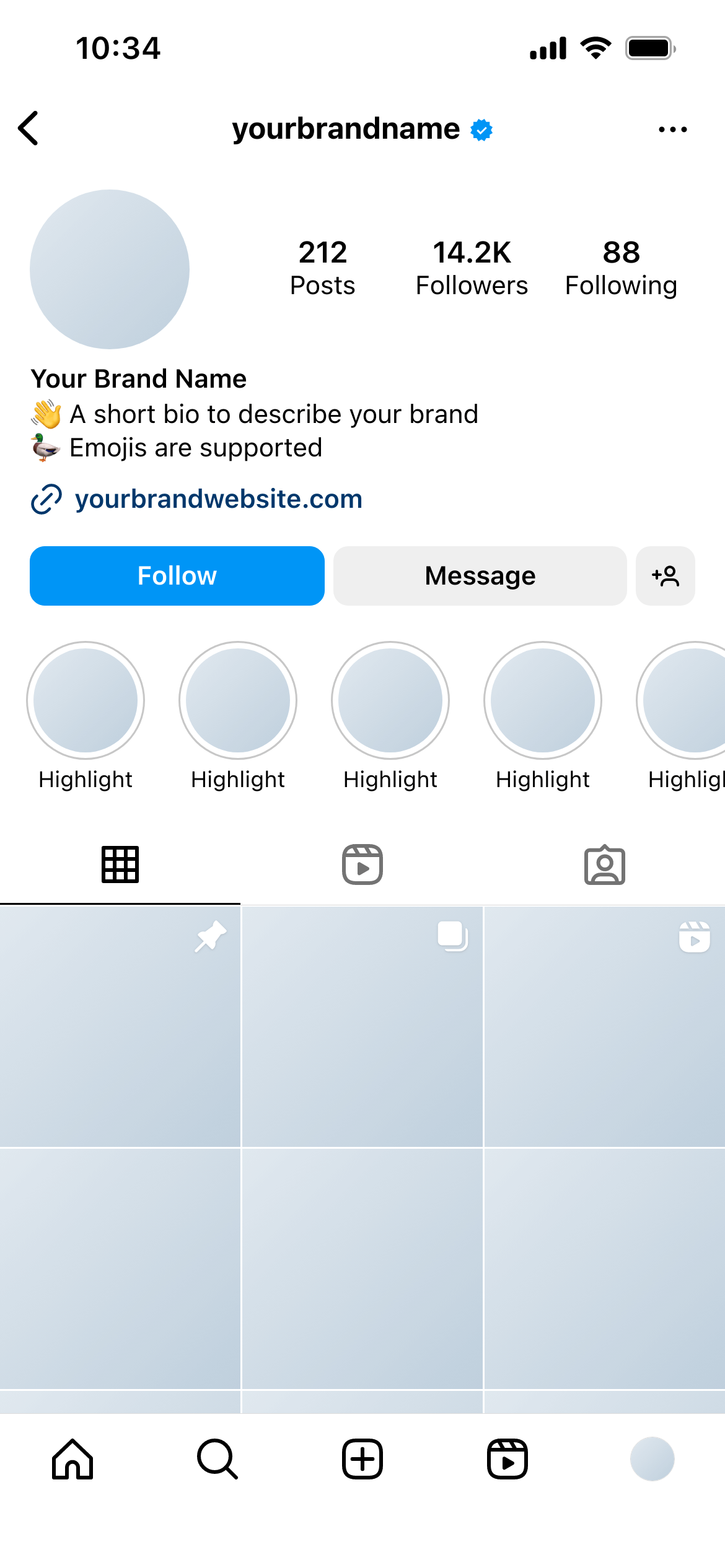
This template shows the nine-post Instagram grid as it appears for users with dark mode enabled - the profile grid view rendered against Instagram’s dark background, with the UI chrome in the dark theme.
It’s the dark-mode counterpart to the Instagram Grid (Light) template.
The grid view is a mosaic of image thumbnails, and the visual impression of the grid depends partly on the background against which the thumbnails are displayed. In light mode, the white spaces between and around thumbnails create one aesthetic. In dark mode, those spaces are near-black - which changes how images with light edges, white borders or pale backgrounds interact with the grid.
A grid that looks cohesive and well-planned in light mode can fragment visually in dark mode if the image edges don’t read well against a dark background. This template lets you catch and address those issues before publishing.
Evaluate images with light edges carefully. Images with white or very light backgrounds will be surrounded by dark spacing in this view. If that contrast looks unintentional, consider adding a subtle border or adjusting the composition.
Use alongside the light mode template. Include both in your client presentation. It demonstrates thoroughness and often prevents a “we didn’t realise it would look like this in dark mode” revision request after launch.
Join thousands of social media marketers like you using Mockupduck to plan, visualize and get fast approval on their social media content