Create real Instagram Grid mockups using our mockup builder - no Photoshop or design skills needed.
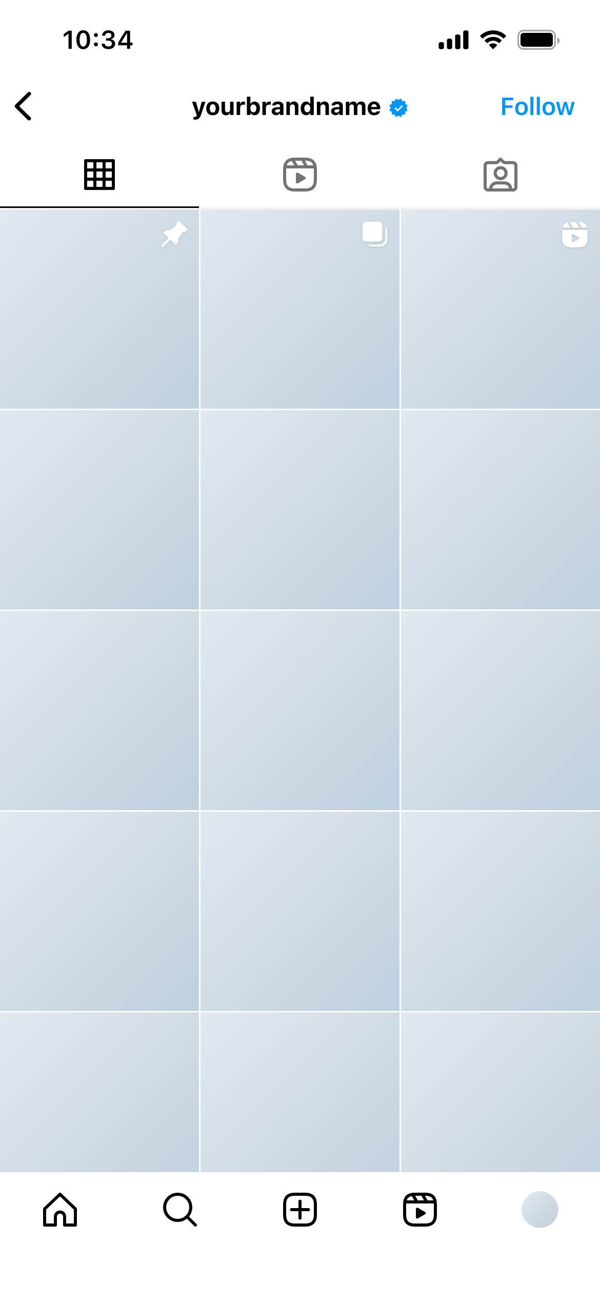
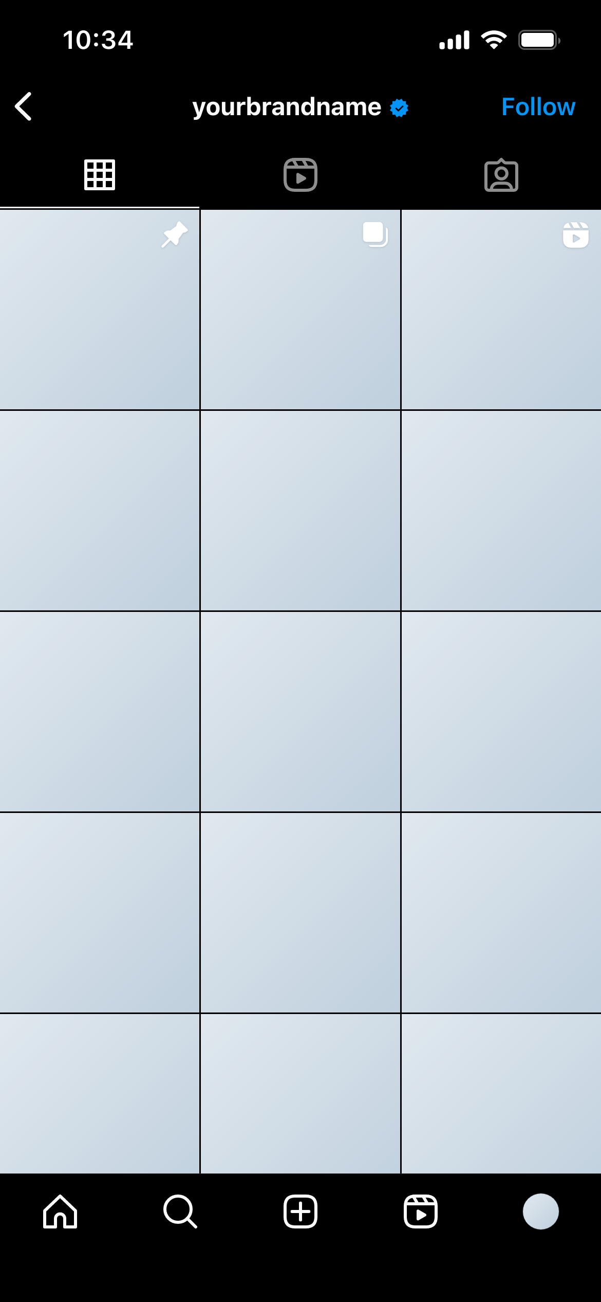
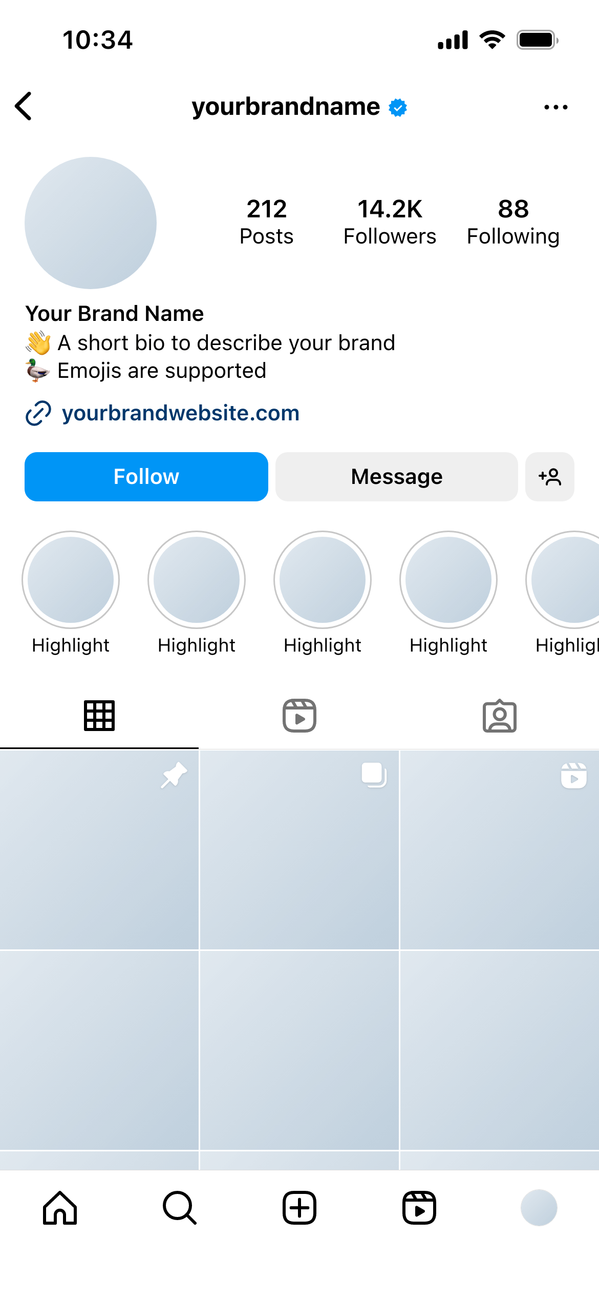
An Instagram grid mockup is a close-up preview of the nine-post grid as it appears on a profile - three columns of square thumbnails, exactly as Instagram renders them. It lets you plan the visual sequence of posts, test how images pair with their neighbours, and present the grid aesthetic to clients before any content goes live.
The Instagram post grid is the first thing someone sees when they visit a profile. It functions as a visual portfolio - and the way posts relate to each other across the grid is as important as how each post looks individually.
A grid mockup answers questions that individual post mockups can’t:
Without a grid mockup, these questions only get answered after publishing - when changing the answer means deleting or archiving live content.
Monthly content planning - Before scheduling a month of content, mock up the full grid to ensure the posts work as a sequence. Swap images or reorder them until the aesthetic is right.
Account rebrands - When refreshing an account’s visual identity, a grid mockup shows clients what the new direction will look like at scale - not just as a single post but as the entire front-of-profile impression.
New account launches - Plan the first nine posts of a new account before anything goes live. The grid mockup becomes the visual brief for the launch content.
Aesthetic pitches - Present two or three different grid directions to a client and let them choose. Much easier to compare when the options are shown side by side as full grid previews.
Use the actual planned content. Even rough versions of the real images are more useful than placeholders. Clients make better decisions when reviewing real content rather than stand-ins.
Think in rows of three. Each row functions as a visual unit. Review each row as well as the full nine-post spread.
Consider the scroll direction. New posts are added in the top-left position. Plan the grid knowing that your current mockup will shift right and down over time.
Check the colour temperature. Images that look fine individually can clash when placed next to each other if their colour temperatures are very different. The grid view surfaces this early.
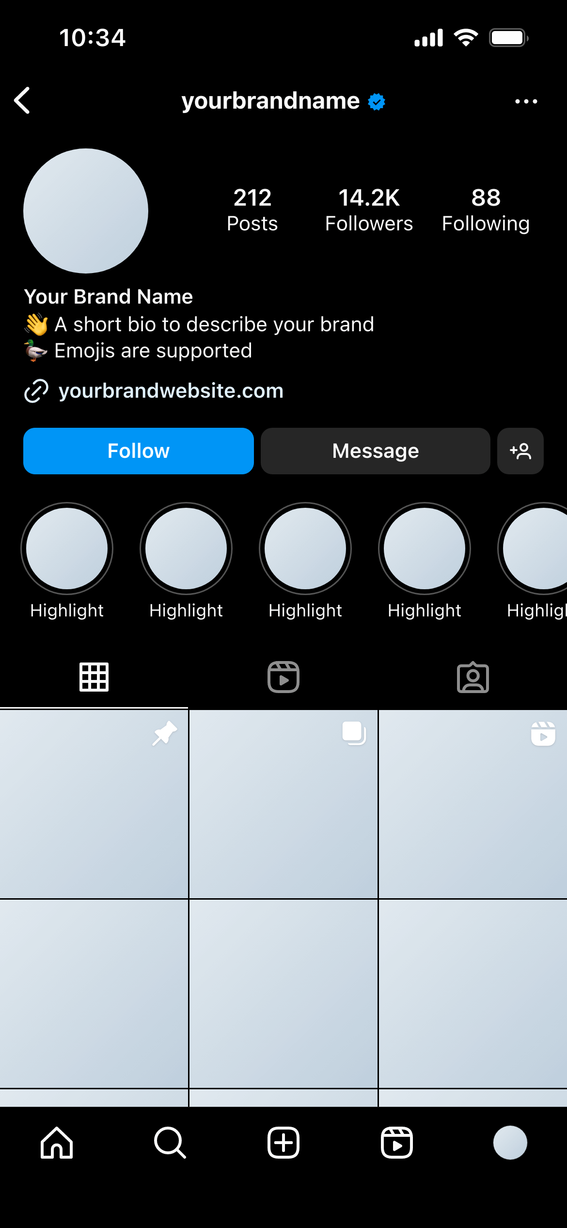
Check it in dark mode. Mockupduck shows how the grid looks in both light and dark mode - useful for evaluating readability across viewing conditions.
Join thousands of social media marketers like you using Mockupduck to plan, visualize and get fast approval on their social media content